

What Copenhagen Is Trying to Tell Us
We went to 3 Days of Design in Copenhagen, and what we noticed was not just the new designs, but five emerging patterns asking bigger questions about where design is heading.

Copenhagen in June has a particular quality of light, to be specific a whole nineteen hours a day. Slightly unreal, it’s the kind that makes you want to stay outside past midnight and argue about things that matter. This year, that light fell on 400 exhibitors spread across eight city districts, from Nordhavn to Islands Brygge, from repurposed parking garages to Renaissance courtyards. Somewhere between the legendary Palæ Bar and the morning swim at the canals, 3 Days of Design hosted its thirteenth edition, and this year the curation was different. Not louder, not bigger in the way Milan or London are, but more critical of the question it posed to the design industry worldwide. The theme “Make This Moment Matter” by founder Signe Byrdal Terenziani framed it as a move from more to meaningful, a recalibration she clearly felt was necessary. And if you spent time walking the rooms and the streets, you understood why she said it. Because there was a version of the festival that was running impeccably, the parties, the product launches, the carefully curated lounge areas, and then there was another version, less tidy and more interesting, happening in the corners - specifically at the +Other Circle exhibition organized by Spacon & X.
For decades, design fairs lived inside exhibition halls. You paid to enter, followed a map, and moved through booths. The experience was transactional - a transfer of information, brand to buyer. Then something shifted. The fastest-growing design events today happen across entire cities, in showrooms and parking garages, in courtyards and former industrial warehouses. You don't follow a route so much as wander into one. And that wandering, it turns out, is part of the point. Around 120,000 people walked the streets. The conversations at the end of each night circled the same eager question: could this expand to more days? The founder says no for now. But the fact that people are asking says something about what the festival has become and its potential to become a melting pot of Scandinavian influence.

Pattern #1 - Raw Materials
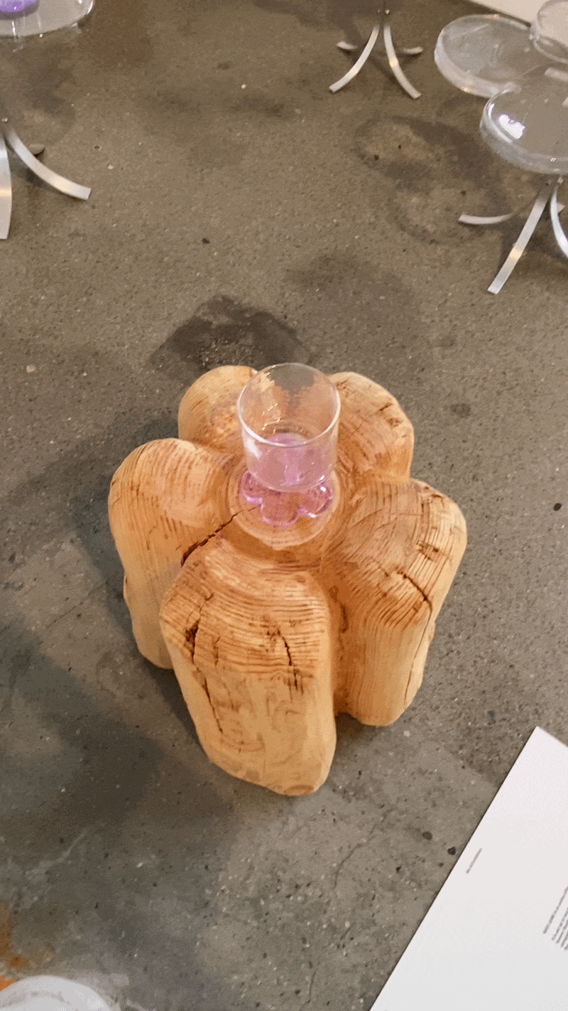
A chair carved directly from a burl wood trunk - the kind of thing that makes you wonder whether it was designed or excavated. A seat built from bamboo joints, unfinished, structural in the most literal sense. A floor installation where real moss, real soil, and real apples rotted slowly in the corner of a gallery, with gold and metallic cube objects sitting in the dirt like artifacts from a collapsed civilization. These objects weren’t asking to be purchased, but rather asking to be reckoned with.
We've seen this impulse ripple across disciplines simultaneously. In graphic design, the hand-drawn letterform has been making a sustained comeback over precision vector work, because imperfection now reads as sincerity. In cinematography, 16mm film and deliberate grain are back, used by directors who could easily afford pristine digital. The tools keep advancing, and we keep reaching backward. Is that nostalgia? Or have we arrived at a moment where the polished surface no longer communicates trust? The furniture makers working with raw materials at this festival were staged as performers, thus making a similar argument: that the closer an object is to its source, the more inspiring it is, which raises the next question. What happens when rawness becomes a style? When will the burl wood chair become as codified as the Eames chair before it?
Pattern #2 - Glass as Art

Glass was the material with the most range, and the most internal contradictions.
It was doing completely opposite things at the same time: thinly blown lamps demonstrated the fragile elegance of the material, while glass sculptures pretending to be bags gave way to a parallel world where there are no social limits to the material. Speakers and vinyl players by Transparent challenged the limits of the material further by going beyond a viral product, to a high end one.
Graphic designers understand this kind of tension intuitively. The same grid that makes Swiss typography feel rational makes brutalism feel aggressive. Glass here functions like a typeface that designers keep reclaiming for wildly different purposes. You start to wonder whether the material has a politics of its own, or if it's infinitely neutral like a mirror for whoever picks it up.
Glass at this festival functioned the same way: infinitely open to interpretation, which is perhaps why so many designers reached for it at the same moment.

Pattern #3 - Chrome and Metal

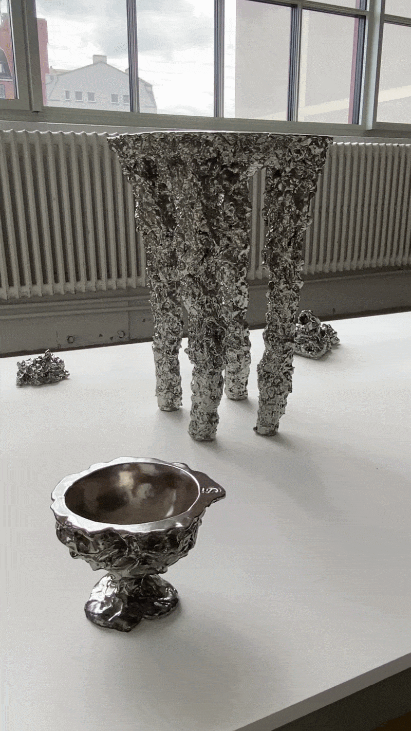
Cold materials are having their warmest moment in years.
The brushed aluminum undulating bench sitting on the grass outside, looking like a freeze-frame of a wave, was one of the most photographed objects of the weekend. Various forms dipped in chrome read like blobs of mercury hanging suspended, or inviting you to lay down, challenging the preconceived intimidation of the material. It was striking to see how quickly metal stopped feeling cold. People were reaching out to touch these objects the way they'd touch velvet.
This shift traveled through fashion first. The move from gold jewelry to silver, landed in the home before anyone formally announced it. And it maps onto something happening in cinematography too, the drift away from warm golden-hour color grading toward cooler, more surgical visual palettes in prestige film and television. Both feel like the same generational recalibration of what "refined" looks like. A generation raised on screens may simply perceive cool light as more honest than warm.
But every aesthetic overcorrects. The question is whether metal's moment is durable enough to outlast its own trend cycle.
Pattern #4 - Playfulness


Eyes mounted on shelves. Lips as bookends. Pink chairs in rounded, cartoon-chunky proportions that recalled the kind of furniture a child would draw if asked to draw "a chair." These furniture objects standing curated in galleries gave the image of a figure at a party who arrived in the wrong costume and smashed it anyway. Beyond designers, Anthropic joined the wave too, with its installation of inflatable bananas, pears, and a single enormous rose, glowing in a darkened room, to showcase Claude’s capabilities for assisting creative technologists.
This thread had a lineage: Surrealism, the Memphis Group, Sottsass, Hayon. The Surrealists wanted to disturb. Memphis wanted to provoke. What does this wave of wit want?
In graphic design, the same question has been circling for years. When does irreverence become the house style? When the joke is this widely shared, when the pink chair goes viral, is it still subversive, or has it become the new legible? The best pieces in this vein managed to hold both: they were funny and technically precise, the craftsmanship, thus, pridefully carrying the humor.

Pattern #5 - Light as Sculpture

A corridor of warm arched apertures, glowing against dark ochre walls, that required you to slow your pace simply to take it in. A room of 3D printed capsule pendants in shifting greens and oranges, hanging at different heights in darkness, resembling bioluminescence more than lighting fixtures. They all invite you to walk among objects that were simultaneously sculptural artifacts and lighting fixtures.
In cinema, the treatment of light as a co-author rather than a utility has a rich tradition. Tarkovsky's pools of light in empty rooms. Wong Kar-wai's neon hazing through rain. The way a single practical light can define a character's relationship to their world. In designed objects, this is still an emerging argument: that the fixture is not a vehicle for light, but what light does to a room is the actual work.
In fact, Danish designers are well known for their extensive care towards “the lighting experience” in any room and building. Showing immaculate attention to detail in both the forms that speak of the design’s character, as well as the soft, undisturbing effect it must have on their audience.
What comes next?
An additional pattern that is worth recognizing not only in this edition, but throughout decades, is that Copenhagen does sustainability better than almost anywhere, and that knowledge is starting to show. All the exhibitors were requested to fulfill certain criteria towards the circularity and sustainability of their materials. It was almost a given that each and every brand was transparent about their process in this movement so far, their dedication to it, and areas worth investing more in.
Nonetheless, Denmark cherishes its high standard school systems and leading role in innovation. This eagerness of knowledge-sharing was prominent in the number of workshops available everyday, from scrap material sculptures, to flower bouquet arrangement. So the local knowledge is openly shared to those who’re willing to learn.
Design has always been a discipline in conversation with itself. But the conversations that move culture are the ones that bring in outside voices too, beyond the European context. The festival at its best is a place where those conversations happen. The question for its fourteenth year is whether it has the appetite for more of that discomfort, or whether it will settle for being the most perfectly curated fair in the world.
Even though the event is impeccably organized and the city serves as an ideal backdrop, yet there's a quality to the whole that NSS Magazine called the "Copenhagen paradox" - the sense that the machine is running so well it has stopped surprising itself. That the insiders have all found their register, their tone-on-tone, their shared vocabulary, and it has become a dialect spoken only among those already fluent. Is it up to the festival to bring more radical designers in, or is it precisely the right requirements posed by the festival that inhibit that inclusivity?
Written by Elza DUKA


Elza is a Creative Producer & Art Director with a degree in Media Arts, Design, and Culture. She has a knack for blending advertising, storytelling, & experiential marketing, together with the interdisciplinary skills to weave them all together.
Get in touch with elza@tomlcollective.com